
29 Feb More Logo NO NO’s
 From the years of doing logo design and PR work for many small businesses, I have become a sort of logo snob. Actually I’m a Logo Bully. I see so many logos that are created by non-professionals or by claimed “professional printers” that are so amateur looking that my 7-year daughters could have designed them just as well. Any printer worth a dang (I’m being nice) should be able to not just print but also design. In the printing world, whether you are printing signs, full color printing, promotional products, or custom apparel, it all starts with design. I so often see printed brochures or business cards and the logo printed on them is pixelated, which means blurred. This is because the file they printed from was low resolution and not print quality to start with. Therefore, you have the garbage in garbage out phenomenon. If you start with a poor file you will ALWAYS have a poor outcome. The most important part of any print job is the digital file and design.
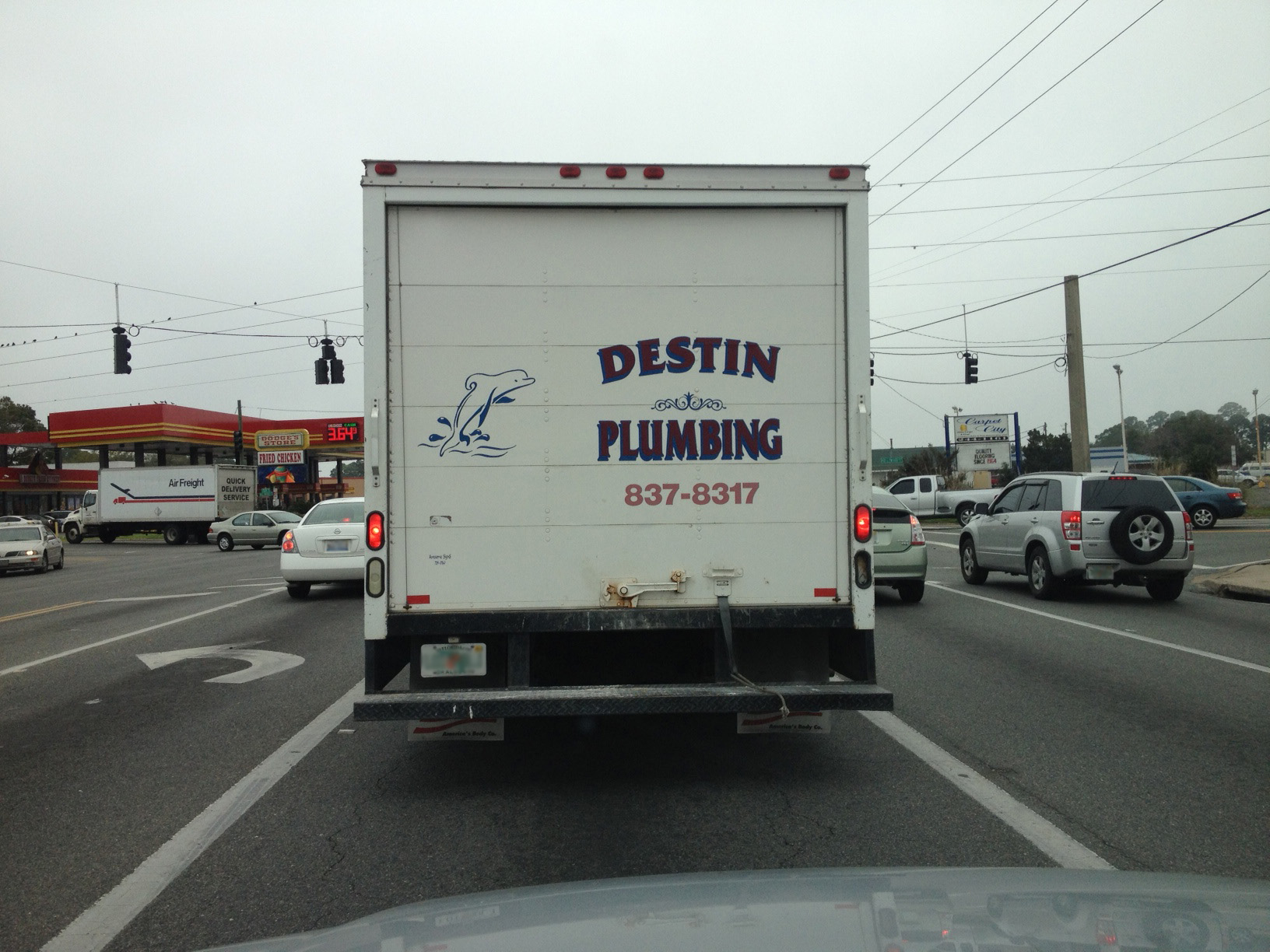
A quality printer should be able to help with logo design in a professional way. If I see someone wanting to print a logo that is sub-par and looks amateurish and unprofessional, I will always make suggestions for improvements. Sometimes business owners will take my suggestions and sometimes they won’t. Driving down the road, yesterday, I saw the truck (pictured above) in front of me with their “logo” printed on the truck. Now I know of this company and they have been in business for over 25 years and do great work; however, their logo definitely needs improvement. I wonder how many people have opted to go with a competitor company just because the competitor had a better front (logo). Here are some of the suggestions for improvement of this logo:
- Improve the spacing for the logo. There is way to much space between the dolphin and the text. I would imagine the reason to be that the “designer” used a non-graphics program such as Microsoft Word to design this layout. Microsoft Word is a word processing program, not a layout tool; therefore, you have very little control of the spacing. Any quality printer should have made suggestions to better improve this layout prior to printing . . . unless this was the printer who laid it out. . . Yikes!
- There is no design correlation. Nothing is really tied together. The various pieces of text and imagery do not have a smooth flow. It’s like every pieces is just a separate random piece. Logos should be designed to be one unit, not a series of unites. It’s okay to sometimes use images unrelated to your business (such as the dolphin for a plumbing company); however, the image to fit within the design layout. Do we call this company only if dolphins are jumping out of our toilet?
- The phone number doesn’t jump out at you when looking at it. It is a much lighter color and smaller than the rest of the “logo pieces.” Therefore, it gets lost. If your vehicle graphics are going to have a phone number, it should be a call to action and really stand out. The purpose is not only for recognition, but also as a call to action. You want phone calls so make sure the phone number is visible.
Do you have a logo that needs a face lift? If you have some good qualities about your current design but just need a better flow and layout for your logo, we can do a logo face lift for you.. However, if you just want to scrap your old design and get a more modern and professional design, we can do it. They don’t call me Logo Bully for nothing. Not only am I hard on other designers’ logos, but I am also hard on my own designers. We only produce top quality logos that will compliment your business well and portray that positive image for your company.
If you see a poor logo design or want your logo critiqued for suggestions on improvement, be sure and send them to us.
No Comments