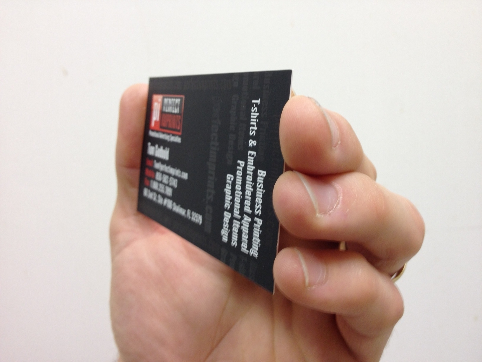
13 Jan What NOT To Print On Your Business Cards

Business cards are a staple of any business. There are very few people in business who can get away with not having business cards. For the rest of us who need business cards, it is very important to have a professionally designed business card in order to portray a positive image of our company. There are many “design your cards online” type of websites out there; however, these are almost always amateur looking designs that will make your business look unprofessional. Is it worth saving 20 bucks on your order of business cards in lieu of having a great design? Certainly not! The most important aspect of any marketing piece, including business cards, is the element of design. Over the past few decades of designing and printing business cards, I have seen many business card designs that were absolutely horrible and unprofessional. As a matter of fact, it is getting worse to the point of an epidemic due to the explosion of “Do It Yourself” cheap business card websites. My suggestion is . . . If you are NOT a designer, opt to have a professional designer layout your business cards for you. Your business card is an extension of your business self and it often times presents a first impression of you and your business. Do you want your first impression with new clients to be positive or negative?
Here are 15 Pitfalls to avoid on your Business Cards:
- Low resolution images that will print blurry.
- Free emails such as Yahoo, MSN, GMail, etc.
- Outdated picture of yourself.
- Phrase on back of business cards that says, “These cards were printed FREE at www.^!&t@p#!#t.com.
- Gramatical Erors (Seriosly, no mispellings) 🙂
- Blank to write in name of salesperson.
- Too many different fonts.
- Colors with strong contrast such as Green on Red.
- Long distance phone number if soliciting local business.
- Microsoft looking clipart.
- Font size 8 point or smaller.
- Too much info.
- Cluttered layout.
- Thermal printed business cards. Really? That’s so 1980.
- Thin card stock. Thicker is better.


Sorry, the comment form is closed at this time.